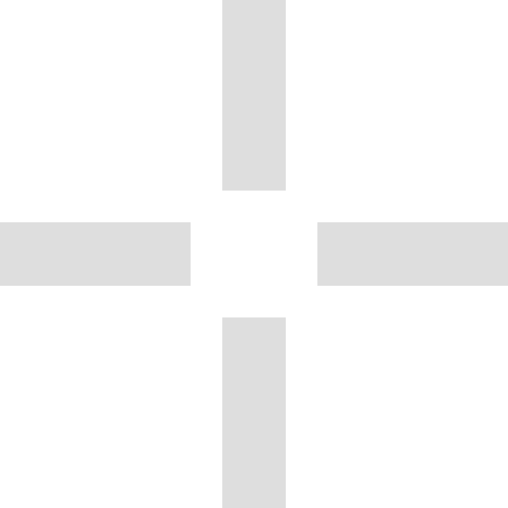
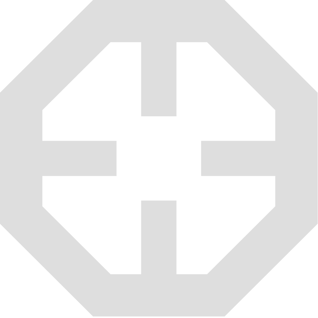
Official AIM Intelligence logos, colors, and usage rules. Everything on this page is the approved artwork — please download it here instead of recreating or tracing it.
The AIM logo starts from the idea of precise targeting and control. The four axes of the symbol are aligned toward a single center — the role AIM plays in aiming at and controlling AI systems.
The symbol can stand alone as an app icon, a favicon, or a social profile image. Never adjust the thickness or spacing of the axes.
For single-color printing and low-contrast media where the primary palette cannot be reproduced.


Click a swatch to copy its HEX. Secondary colors are functional — they carry meaning and must not be used as the representative brand color.
Keep clear space of at least half the symbol width (0.5a) around the logo. Minimum size is 40px wide on screen and 1.0cm wide in print.
 40px wide — minimum on screen1.0cm wide — minimum in print
Use the left mark on light-toned sites and the right one on dark-toned sites.
Each product line has its own symbol and wordmark built on the same grid. A product logo must never be merged with the AIM brand logo — keep a clear hierarchy and enough space between them.








Logos for product lines that have not been announced yet are available on request.
The examples below are all incorrect. They are drawn here only to show what to avoid.
Image resources for press coverage and team communication.






Correct
AIM IntelligenceAIM Intelligence Co., Ltd.주식회사 에임인텔리전스
Incorrect
Aim IntelligenceAIM intelligenceA.I.M.AIM-Intelligence
Anything not covered here — including brand guidelines, key visuals, and other source files — is available on request. Contact us
Based on AIM Brand Guidelines v2.0